For the first letterhead I'm working with the fossil photo from the ammonite exhibit at the museum - it's the image I clipped for the "M" in the logo. Can't see the address information but it's along the bottom of the
stationary.
For the next letterhead I'm playing with a repeated inverse pattern of the "M". I can't decide whether to put it along the bottom of the letter or stacked along the side. We'll see.

Wanted a simple scrolling at the left top of the letterhead. Then I put the logo and address at the bottom. This is my least favorite - had the idea that the back page would have a scroll pattern in either a different color (brownish gray with ivory scrolling) or a very, very subtle ivory scrolling that is a slight difference in color. Like a watermark.
I wanted to do a background pattern with the logo. My inspiration was an envelope from Sam Flax that looked very 1700s. This is not looking like that at all. Still working on it - want it to feel organic.
This one is the outline of a frame. I tried for simple lines but think it's not quite there.
One other design was to use a watermark on the stationary. The JPEG is showing the area outside the letterhead where I played with the swirls in the "M" - it's not showing the watermark because it's so light. Didn't look too good so I stopped.
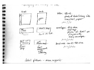
SKETCHES STARTED


.jpg)
the last one looks like it a shadow of a wall 'perspective'
ReplyDeleteI like your least favorite probably you might need to push it a little more but i like the curls forming at the top. maybe working on the logo placement. love the color of the background too on that one.