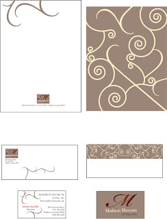
I played with the logo on the left stacked and didn't like it as well. Also played with a more random blocking and didn't like it as well.
Of course, I have to include a scroll pattern. I like the back being a different color. When you put the folded letterhead into the stationary it makes a beautiful image to put into the envelope. Reflected the pattern on the envelope flap - I like it.
I changed the frame to surround the logo - I like it much better than I had it originally - to the side and bottom.
Just love the fossil - it looks better on the monitor than it's printing out. To really get the brilliant color I think I need really brilliant white paper.


No comments:
Post a Comment