Saturday, May 1, 2010
Museum Gift Bag reworked
Thursday, April 29, 2010
Print and Specialty Ad boards
I changed my direction at the last minute. I just couldn't let go of my FINE idea - fine art, fine wine, fine dining, fine living, fine etc. It was coming off stuffy and flippant though - not at all like the museum. So I changed my thoughts and let go. I like this ad much better because I think it's whimsical and fun but gets to the promise of the museum - to bring fine art to rural Georgia. Had to let go of my giant moon too.


Monday, April 26, 2010
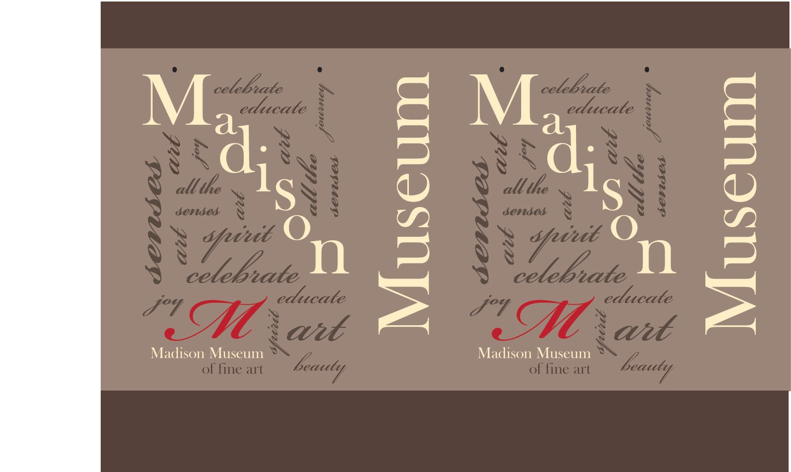
Museum Gift Bag - latest draft

About the 5th version of my gift bag. I changed the font to Baskerville and I like it better - looks more like a museum. But that meant I had to go back and change other projects. Ugh! But I'm happier with it.
Print Ads - latest draft
I've been playing with the copy and the images. Photoshoping a wine glass is harder than I thought - still working on that. Fingerpainting (got paint everywhere) and art from my 2D class. I'm getting closer to the message I wanted to express about the museum. Fine art without the attitude, museum with an intimate and cozy setting, etc. Think I need some wine in the wine glass - needs a pop of color in the bottom corner to match the fingerpaint hand.


Friday, April 23, 2010
Notecards - 2nd draft

Like this set better - it's Mondrian, Matisse, Picasso and Calder - just like this Calder better than the other one. I'm still playing around with them.
Thursday, April 22, 2010
Another idea for art cards - with a strawberry trist

Mondrian, Matisse, Picasso and Calder. Don't like the Calder - I'm looking at another one of his works to fit better with the set. Don't like the strawberry just hanging in the landscape. This is the Calder they have at the museum but it just doesn't work.
Tuesday, April 20, 2010
Strawberry Moon Tea - Print ad draft

Print ads - 1st draft

I took the photos of the graffiti and picture frame. I "borrowed" the photo of the wine until I decide whether I'm going to use this set. I'll take something swirling around in a wine glass if I decide to go with it. Still not sure about the copy either.

None of these photos are mine - I'll have to take photos if I decide to go with this set of ads. I tried illustrating the items but they didn't look as sophisticated as photographs. After the critique tomorrow, I'll decide on direction. Still working on the copy.
Monday, April 19, 2010
Specialty Item for Museum
I decided to use an upcoming event at the museum to tie in my specialty item. They are having a Strawberry Moon Tea in June as a fundraiser. I thought that I could give everyone that donates a set of graphic notecards from the museum. I've been playing with moons, strawberries, patterns and tea images - also with famous artists quotes, quotes about art, illumination quotes, etc. Here's the first draft of the set. Still working.

Museum gift bag

Doesn't look like much now but I'm making a gift bag for the Museum Store. I took apart one of my gift bags and think I can make it to hold my specialty item.
Saturday, April 17, 2010
Somewhat disturbing ad

I've always heard that people's faces are not symmetric and that if they were it would not be pretty. I think this ad definitely proves it. So interesting how many clever ads don't showcase the product at all - it's the idea. I know I will remember this ad but I'm not sure I will remember it's for a Nissan Cube.
Other Museum Ads - interesting


Top from Tropen Museum - every piece has a story - I like this concept and that's something that Madison Museum also stresses with art history - there are so many interesting stories behind the art piece. The New Mexico Museum puts people into historic pictures - with the tagline "History, Get Into It!" My favorite print ad is the Denver Museum Titanic Ad - very clever - the color, type and shapes all work so well together. I found myself reading the entire copy - which says quite a bit about the ad. The Wolfsonian Museum with the taglines "The Museum of Thinkism" and "Design Mirrors Society" with the futuristic image and soft coloring, makes for an interesting ad.
Wednesday, April 14, 2010
Other Museum - search for specialty items


Various Museum specialty / store items - (from top) note cards from Louvre and High; High Museum wrapping paper; Louvre bookmark, notecards and placemats; gift wrapping from MMoA, gift membership pin; stationary and shopping bag. Liked the nostalgic seed cards from the Smithsonian.
More Interesting ads

Love this ad for hair color - the dark background and the pop of red taking up most of the frame. It took a minute before I realized it actually was hair.


Interesting ads from Harvey Nicoles - the way the photos center the product and surround it with similar images - it's not too busy though because you get the message without having to look at each individual picture. Love how each ad complements the overall message of the product with color/grid/framing.

With little color and type this ad does a good job of getting the message across. One donor can save 8 lives.

Love this ad - the use of stainless-steel color and diagonal lines throughout give it interest - message is very clever - sleep like the dead, although not expected from an ear plug company. Especially love the little detail of the tag on her foot.
Wednesday, April 7, 2010
Print Ad Inspiration


Starting to look at print ads - these are from allgraphicdesign.com and sideroad.com. So simple - not a lot of text or clutter - love the negative space. The message comes across loud and clear.
Monday, April 5, 2010
Final Brochure Board (maybe)
I combined the open doors with the "M words" from the 2 previous brochures. I like the symbolism of the museum doors opening - they do make people feel like they are welcomed guests - come in and make yourself at home. I think it ties to art history as a journey - open doors, open minds, etc.

Thursday, April 1, 2010
Brochure 1st draft
The outer panels fold in and mimic a door opening. I changed the photos to black and white and then tinted them in brown.
The accordion fold on the bottom uses "M" words to describe your special event with the Madison Museum. The outside panels house customer testimonials.


Sunday, March 28, 2010
Fancy Feast Updated Look
Fancy Feast updated their look - the cat's eyes are now blue, the font is thinner with yellow outline, added text for 100% complete and balanced (circle beside Fancy Feast), recycle type larger and reworked coloring. They moved "Guaranteed Analysis: Crude Protein, Crude Fat, Crude Fiber, Moisture, Ash and Taurine" before the ingredients (yum!) Interesting changes but I can't say I like it better.

Wednesday, March 24, 2010
Brochure Fold sketches
Playing with folds and diecuts.
Top left - Wanted the diecut rectangles to mimic art frames - gallery style. May get to abstract for the feel I want. We'll see.
Bottom left - Also playing with more of a book feel with each page revealing the next page. The back could be tricky. Still playing.
Top right - playing with a std letter size foldout but with the last 2 pages cut to different shape. May not work at all - and I would play with the shapes as the photos/illustrations/content is layed out.
Bottom right - I liked the idea of photos down the left side and text on the right - with some type of spiral shape to connect each section. I was thinking about having b&w (tinted brown) photos and text with the spiral connector having the pops of color.
I am constrained a little by the size of the paper I want to use. It's 12 x 18. Still lots of choices and decisions.

Inspirational Museum Facility Rental Brochures


Kemper Museum - very playful and fun. The cover page has the tagline "Your Event is our Masterpiece". Love that. I love the "story" of this brochure. The first page has a testimonial from a 40 year old woman celebrating her milestone birthday. It has the caption "Create Your Own Story - Because I'm a Work of Art in Progress, the Kemper Museum was the perfect place to celebrate my milestone birthday".
Other quotes - For Business - Warhol said, "Good business is the Best Art".
For Wedding - "Art is Forever - Like Us"
Last page has an ad for "ARTINI NIGHT" - how fun is that?


Peggy Notebaert Nature Museum - very elegant brochure. The photographs are gorgeous. The colors and lighting help to give it that magical feeling. The charcoal brown rectangle throughout the brochure helps to give an elegant, consistant feel to the brochure. The front and back are connected through the use of the soft green color. Love that pattern on the back. Notice the use of typeface throughout. The logo is very tribal, nature-museum looking but they only use it on the back.
Subscribe to:
Posts (Atom)