I'm amazed at everyone's work. Same project but everyone is so different and creative. Working with transparencies had it's challenges. One was that I couldn't keep it clean - if I used windex on it, some of the coating came off. So it looked more like Cristina's finger print box.
Friday, December 11, 2009
Friday, December 4, 2009
Packaging Project 1st Drafts
I'm working on desk caddy for rubber bands - I wanted to use a design inspired by rubber bands and came up with these retro looking shapes. Still playing with color and paper.
Wanted to add a pencil caddy for pencils to make a desk set. Can't really tell it from this but the designs are modeled from pencil shapes. Still working on it - don't know if it will work out. I'm using transparencies for the top (pencils) and wrapper (rubber bands) so that the advertizing information can be taken off. Can't show you that because I haven't found a large enough transparent paper for the cutouts. Sam Flax says they have some.
Wednesday, December 2, 2009
More packaging inspiration
More inspiration for my package. Love the innovative shape and design of these Kleenex boxes - summer campaign. Like my package, the container serves as a decorative accessory.
This decantor is absolutely beautiful and sculptural. It cost a mere 3000 pounds (about $4500 in US dollars). I love the sophistication.
Such cute packaging for earphones. I like that each one is individualized.
This website has the winners of design packaging and other inspirations.
Tuesday, December 1, 2009
Packaging project
Started off wanting to repackage batteries. But my idea to get rid of the plastic and design a box that could be easily mailed back to the manufacturer wasn't realistic. (The idea was to free the landfills of toxic battery leakage and make it easy for the consumer to recycle). England has a program now that collects batteries in a special box with your recycle bottles, cans, etc.
Finally after scouring hardware and office supply stores, I found something to repackage. I found rubber bands for $.45 in a plastic bag. I want to package rubber bands in such a way that the container becomes a desk caddy to store the rubber bands after you open them. I have a design and am working out the bugs - and there are many. I am experimenting with paper and want to do something see-thru - if it looks ok. I'm learning that measurements and cutting even lines are key to a successful 3D box shape. I'm excited that at least I have an idea now.
Finally after scouring hardware and office supply stores, I found something to repackage. I found rubber bands for $.45 in a plastic bag. I want to package rubber bands in such a way that the container becomes a desk caddy to store the rubber bands after you open them. I have a design and am working out the bugs - and there are many. I am experimenting with paper and want to do something see-thru - if it looks ok. I'm learning that measurements and cutting even lines are key to a successful 3D box shape. I'm excited that at least I have an idea now.
Tuesday, November 17, 2009
Bad Packaging
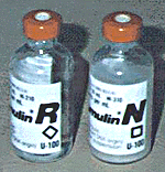
Bad Design - These packages of insulin are so similar but not the same insulin. Taking the wrong one could send you to the hospital it says.

This is pretty bad - don't really need to comment.

Funny - not only do we have bad packaging (tighter and stronger than the doors on a bank vault) but now they have invented tools to get into the bad packaging.
Sunday, November 15, 2009
Packaging Project Idea
I decided to "energize" the current battery packaging. Seems like they've been in the same plastic package for a while. I want to get rid of the plastic and I have a few ideas (but we'll have to see if they will work first).
Wednesday, November 11, 2009
Fun and interesting packaging
Packaging for teas are usually exotic and interesting.

Because it's such an iconic label, I really like the simplicity.
Thought this was so clever and hilarious.
Just love the tie in to the product.
Another simple solution - just love it.
Martinis and IMAX event poster
Book cover reworked
After the book cover critique, I made some changes to the back book cover. I removed the grass from the back cover and added an excerpt from the book to better explain the Messiah's Handbook - kept the quotes (they are a few of my favorites). I added an extract from the book to explain the Messiah's Handbook. Also added the feather to the front cover and removed "by" author on the front and spine. I don't think it looks as busy as it did. Thanks for your comments.
Wednesday, November 4, 2009
Interesting Event Posters
I like the bold splash of red and the way the type swirls with the hair.
Loved the use of color and the vintage look to the poster (interesting use of information on the newspaper at her feet and the way Fillmore is captured in lights).
What can you say here - love the eyes, the mouth, the simplicity of shapes (curve of the top of the head, the shoulders and the neck), the color, the type.
It's so Grace Jones.
I'm partial to butterflys but I love the way this one was used.
I was attracted to the colors first, then the imagry and type.
Of course, I love anything with swirls and semetry. Like the way the G and D intertwine (where's spellcheck?). I like the layering as well. I wouldn't have used these colors but they work.

So simple but effective. The black background with white type and the pop of red shoes, perfectly reflect a gala. Love the touch of the reflection of the red shoe at the bottom and the lines the heels make.
I like the use of type although I can't make out what it says (not so good). I like the way the bottle is highlighted in the lower right corner. It has a feeling of lightness to me and I would expect the wine to be the same.
I like the way this poster opens up to reveal the lone figure in the center. Because of the semetry and use of only a few colors here, it's not so busy.
Fun use of primary colors and simple circles. Has a sense of childhood and baloons. Clever use of type in the center circle.
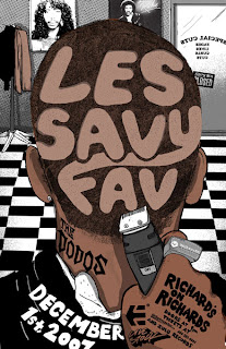
Thought this was really clever and interesting. I can see the barbershop with the hair on the floor. Think all the little details (razor, ring, diamond stud earring, posters on the wall, coat rack and door) are fun.
Tuesday, October 27, 2009
Book Cover Final Draft
Was having so much trouble with the color. It was coming out pea green and all the blue had a brown tint. (Thank you Charles for your help in figuring out the problem).
Sunday, October 25, 2009
Wednesday, October 21, 2009
Book Cover First Draft
I have my challenges. First, these don't make a cohesive grouping, got to work on that. Second, my technical skills are growing but may not grow fast enough for this project.
I do like the major figure walking on water as the central theme on the front cover. I also like the concept of the Messiah's Handbook on the back cover with quotes and referenced items flowing from it. I'm trying not to be so "feminine" on this project - we'll see how that goes (so tempted to add swirls somewhere).
Interesting Calendar Designs
Liked the visual for this calendar - to see time compressed this way.
Bubble wrap - I would be tempted to pop more than just the current day.
Really makes you think about time running out. Each day is shredded in 24 hours.
Took me a few minutes to get this one - I love it.
Very simple but I love the feel and the colors.
Monday, October 12, 2009
Wednesday, September 30, 2009
Fotografiks 2nd review
Liked the roadside sign and the "T", very "bright".
Interesting use of typography - would you let them fix your computer?
Wonderful mural in Griffin, GA.
Thought the typography was a good choice for a Golf and Country Club. (love the heron in the 'b').
Some people love typography - even on their cars.(rush hour traffic - that's why it's blurry).
Walked a labyrinth - I am fascinated by them and their history - that's why I chose the noun labyrinth for my 2nd project.
Tree of Life at the DeKalb Medical Wellness Center. Each leaf lists the name of a sponsor.
Another Barnes & Noble store - cool display.
I liked how the car window framed the Plaza Theater sign. (raining again).
The age of digital - thought this was interesting - dynamic typography.
One of my favorite movies - like the poster too.
Subscribe to:
Posts (Atom)


