Tuesday, November 17, 2009

Bad Packaging


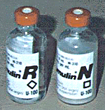
Bad Design - These packages of insulin are so similar but not the same insulin.  Taking the wrong one could send you to the hospital it says.


This is pretty bad - don't really need to comment.


Funny - not only do we have bad packaging (tighter and stronger than the doors on a bank vault) but now they have invented tools to get into the bad packaging.

Sunday, November 15, 2009

Packaging Project Idea


I decided to "energize" the current battery packaging. Seems like they've been in the same plastic package for a while.  I want to get rid of the plastic and I have a few ideas (but we'll have to see if they will work first).

Wednesday, November 11, 2009

Fun and interesting packaging


Packaging for teas are usually exotic and interesting.

Because it's such an iconic label, I really like the simplicity.

Thought this was so clever and hilarious.
 Just love the tie in to the product.

Another simple solution - just love it.

Martinis and IMAX event poster


I had fun with this challenge, my first face in Illustrator.  I worked on the hair more than it looks like I did - good looking hair is harder than it looks. Tried many tutorials: wind, volcano, lightning, fire - love the fact that there are so many out there but I need the version that tells you what to do when they don't exactly work like they say.

Book cover reworked


After the book cover critique, I made some changes to the back book cover.  I removed the grass from the back cover and added an excerpt from the book to better explain the Messiah's Handbook - kept the quotes (they are a few of my favorites).  I added an extract from the book to explain the Messiah's Handbook.  Also added the feather to the front cover and removed "by" author on the front and spine.  I don't think it looks as busy as it did.  Thanks for your comments.

Wednesday, November 4, 2009

Interesting Event Posters


I like the bold splash of red and the way the type swirls with the hair.

Loved the use of color and the vintage look to the poster (interesting use of information on the newspaper at her feet and the way Fillmore is captured in lights).

What can you say here - love the eyes, the mouth, the simplicity of shapes (curve of the top of the head, the shoulders and the neck), the color, the type.
It's so Grace Jones.

I'm partial to butterflys but I love the way this one was used.

I was attracted to the colors first, then the imagry and type.

Of course, I love anything with swirls and semetry.  Like the way the G and D intertwine (where's spellcheck?).  I like the layering as well.  I wouldn't have used these colors but they work.

So simple but effective.  The black background with white type and the pop of red shoes, perfectly reflect a gala.  Love the touch of the reflection of the red shoe at the bottom and the lines the heels make.

I like the use of type although I can't make out what it says (not so good).  I like the way the bottle is highlighted in the lower right corner.  It has a feeling of lightness to me and I would expect the wine to be the same.

I like the way this poster opens up to reveal the lone figure in the center.  Because of the semetry and use of only a few colors here, it's not so busy.


Fun use of primary colors and simple circles.  Has a sense of childhood and baloons. Clever use of type in the center circle.

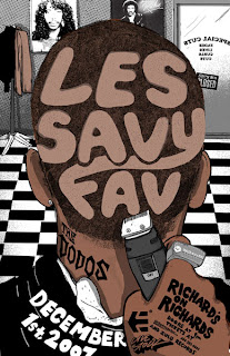
Thought this was really clever and interesting.  I can see the barbershop with the hair on the floor.  Think all the little details (razor, ring, diamond stud earring, posters on the wall, coat rack and door) are fun.